Get an estimate for your video project in less than a minute.

Get an estimate for your video project in less than a minute.
Kinetic typography is text that moves on screen to express meaning rather than simply sit over an image. This page covers its main styles, where brands use it and how to plan a sequence people can actually read. It also looks at familiar kinds of examples and the common choices that can make moving words harder to understand instead of clearer.
| What is kinetic typography? Kinetic typography is animated text whose movement, size and timing help express the meaning of the words. It developed from film title sequences and spread to music videos and digital video. Brands use it for social ads watched with the sound off, event openers and product launches. It is part of motion graphics, focused on text alone. |
Kinetic typography is animated text whose movement contributes to the meaning of the words.
A title might grow to express emphasis. A phrase might arrive in parts to follow a voice. Words can gather or separate to show a relationship. The movement should have a reason that the viewer can feel without needing to analyze it.
Simple captions serve a different primary purpose. They provide a readable text version of speech or sound. Captions may move or highlight words. But their first job is access to the spoken information. Kinetic type treats the text itself as the main visual performance.
A static title identifies a subject without changing over time. A kinetic title uses its arrival and behaviour to establish tone. The same words can feel calm or urgent depending on their timing and placement.
Kinetic text sits within the wider practice of moving graphic design. It does not need a character or filmed background to carry the scene. Shape and rhythm come from the lettering itself.
Readability remains the test. If the viewer notices the motion but misses the sentence, the animation has worked against the communication. We would judge the sequence at its intended screen size and pace rather than only as an attractive still frame.
I see the ability to work with typography as a design skill. I say that because I’ve seen graphic designers who are great with type move into kinetic typography, and their work always looks amazing. To me, it’s like a great presentation brought to life with motion. The presentation already looks good; the motion is just the icing on the cake.
Kinetic typography developed through moving film titles and expanded into music videos and digital communication.
Mid-twentieth-century title sequences showed that words could contribute to a film’s visual identity before the main action began. Text could arrive in a rhythm or take a shape that prepared the viewer for the story. A title no longer had to function as a still card.
Music videos gave moving type another setting. Words could follow a vocal rhythm or interact with imagery. The relationship between sound and lettering made timing a central design choice. The sequence could suggest a feeling without reproducing a literal scene for every phrase.
The web era widened the places where animated text could appear. Short videos and compact screens made a clear written message useful even without a large filmed sequence.
The tools changed. But the central idea stayed consistent. Text has a visual form and a duration. Changing either can alter how the words are understood. Strong kinetic typography uses both intentionally.
The main types of kinetic typography differ in what sets the rhythm and what the words need to communicate.
Audio-led type follows a voice or musical phrase. Words may appear as they are heard or stay longer to emphasize an idea. The timing needs to serve reading as well as sound. A quick vocal passage can contain more words than the screen can comfortably show. The designer may need to select the important text rather than give every sound equal visual weight.
Title sequences use moving text to establish the identity and tone of a film or event. The lettering can interact with images or stand on its own. Its rhythm prepares the viewer for what follows. The names and titles still need to remain readable. A strong treatment makes the motion feel connected to the subject rather than applying an unrelated visual effect.
Social text sequences can make a spoken idea understandable without audio. Selected words may receive visual emphasis while the surrounding text stays calmer. Quote videos put the written statement at the centre of the frame. The animation needs to preserve the reading order. Moving each word independently can make a straightforward sentence unnecessarily difficult to follow on a small screen.
Data-led type uses changing numbers and labels to show a comparison or result. Motion can direct attention to the relevant value. It should not obscure what that value measures. Units and context need to remain visible. A number that grows dramatically without a clear label may feel impressive while communicating little. The animation should help the viewer interpret the information accurately.
Brand message sequences use type to carry a connected statement about an organization. The writing sets the structure before the motion begins. Each phrase should lead naturally into the next. Different emphasis can distinguish the central claim from supporting words. The design needs enough consistency to feel like one voice. Constantly changing the treatment can make the message feel fragmented.
Useful kinetic typography examples show how moving words can set a tone, follow sound or carry an advertising message.
Film title sequences use the scale and placement of lettering to establish expectations. A restrained arrival can feel deliberate. Broken or abrupt movement can suggest tension. The useful example is the relationship between the treatment and the film rather than the complexity of the animation alone.
Music videos often connect written words to vocal timing. The text can make a phrase visually prominent while the surrounding image stays simple. A successful sequence gives the viewer time to recognize the words even when the music moves quickly. No lyric needs to be reproduced here to understand that relationship.
Advertising can use a small amount of text to build a clear progression. A problem can appear first and a product statement can follow. The motion can connect those ideas without requiring a filmed setting for every sentence. The sequence still needs a coherent written message underneath its visual treatment.
The finished timing and screen format are part of the example. A still image cannot demonstrate whether a phrase stays visible long enough to read. Watching the sequence at its intended pace is the useful way to judge the type treatment and its relationship to the message.
Brands use kinetic typography wherever a written message needs to carry meaning through a short moving sequence.
Yes, kinetic typography remains useful because it can communicate a message when the viewer has sound turned off.
Muted viewing makes readable text valuable. The proportion varies by platform and viewing context. A 2019 study by Verizon Media and Publicis Media found that 92% of respondents watch video on mobile with the sound off.
The practical benefit does not require a percentage. A written message can reach someone who cannot hear the voice track. Movement can then direct attention to the words that matter most.
That value depends on execution. Text that moves too quickly is not an accessible substitute for speech. A sequence that demands repeated viewing may also fail in a short ad. The useful approach gives the writing room to be read and uses animation to support its structure.
Plan a kinetic typography video by finalizing the words and reading rhythm before designing the motion.
Write the words first. Build a connected message that makes sense without effects. A video script helps establish the order of ideas. The animation should give that writing a visual performance rather than disguise a weak or incomplete statement.
Cut the text hard. Keep the words that the viewer needs. Remove duplicate explanations and phrases that delay the point. A screen has limited reading time. A concise sentence gives the design room to establish emphasis without forcing the viewer to chase several competing lines.
Time the text to the voice or music. Read the sequence at the intended pace. Spoken timing is a useful starting point rather than proof that the text can be read comfortably. Important phrases may need to stay visible beyond the sound that introduced them.
Pick one or two typefaces. Use a small set of letter styles with clear roles. Consistent choices help the viewer recognize headings and supporting text. A new font should not be the default way to create emphasis. Size and spacing can often do the job.
Keep it readable on a phone. Test the actual frame at a small size. Thin letters and long lines may disappear. The contrast needs to hold against the background throughout the movement. A strong full-screen preview can hide problems that become obvious on a smaller display.
Plan each screen shape. A wide composition will not always crop into a useful vertical version. Decide where lines break and where the text sits in each format. That keeps the message intact instead of treating the alternate version as an afterthought.
Common mistakes in kinetic typography animation make viewers work harder to read the message than the idea requires.
Kinetic typography is one of many animation styles. You can compare it with the others on our styles page.
These answers focus on choosing and planning moving text for a business video.
Kinetic typography is animated text whose movement helps communicate meaning. Words can change size or position to emphasize an idea. It is part of motion graphics. The important distinction is that the text performs visually rather than simply appearing as a static label or a transcription of speech beneath another main image.
A title sequence that builds a phrase through timed movement is an example of kinetic typography. So is an ad where the central statement appears in a deliberate reading rhythm. The movement should contribute to emphasis or tone. Text moving for no clear reason may be animated. But it does not necessarily communicate more effectively.
Yes, it remains useful for messages that need to work without sound and for sequences where words are the main visual material. Its relevance depends on clear writing and readable timing. A simple phrase with purposeful movement can work well. Complicated motion cannot compensate for a sentence the viewer has no time to read.
Kinetic typography focuses on moving text. Motion graphics is broader and can include shapes, diagrams, icons and other graphic elements. A video can combine both. The distinction helps describe what carries the message. If the words are the central visual performance, kinetic type is the more specific term for that part of the work.
It should be long enough for the message to be read comfortably and short enough to avoid unnecessary repetition. There is no useful universal runtime for every brief. Read the exact copy at its intended pace and allow holds for emphasis. The amount of information and the viewing context should determine the duration.
Yes, moving text can make a social ad understandable without audio. The copy needs to stay concise and readable in the intended screen shape. Important words should have room to settle. A design that works in a wide frame may need new line breaks and placement before it becomes a useful vertical version.
Short kinetic typography pieces of 10 to 30 seconds fall within our $2.5K to $5K short-form range. A 60 to 90 second motion graphics video starts at $5K. The work depends on the amount of text, the complexity of its movement and the required versions. A restrained sequence and a heavily choreographed design are different scopes. We would review the copy and intended formats before confirming the production work behind the quote.
Kinetic typography works when the words and movement share a clear purpose. Start with a message that reads well on its own. Then use timing and placement to give the important phrases attention. Keep enough stillness for people to read. A strong sequence leaves the viewer with the meaning of the words rather than only a memory of how quickly they moved.

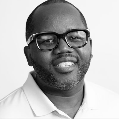
Larry is the Founder and Producer at Mammothic Films, with more than 15 years of production experience. He leads a team that creates story-driven videos for businesses and brands. A marketer, designer, and animator, Larry has overseen the production of more than 1,500 videos for Fujitsu, Logitech, Warner Brothers, NFL, Blockdaemon, Astronomer, Canonical, and 370+ other companies in Canada, the United States, and around the world.
Larry is a devout Christian who believes in placing God first, and that everything else is a blessing that comes from serving Him. When he’s not working, he’s hanging out with his wife and three kids, playing the piano, or sightseeing.
We use cookies to improve your experience on our site.
Manage your cookie preferences below:
Essential cookies enable basic functions and are necessary for the proper function of the website.
